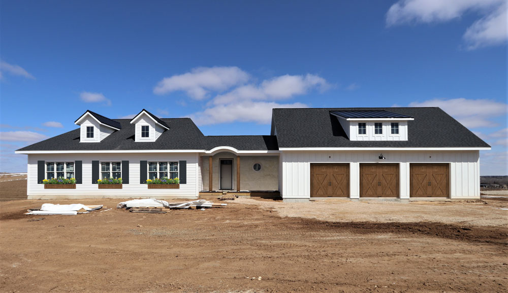
The location is great. It’s proximity to the garage makes carrying in the grocery bags a short trip. It’s right off of the foyer and serves as a welcoming place for guests to gather. Last but not least, it’s close to the patio for grilling out.

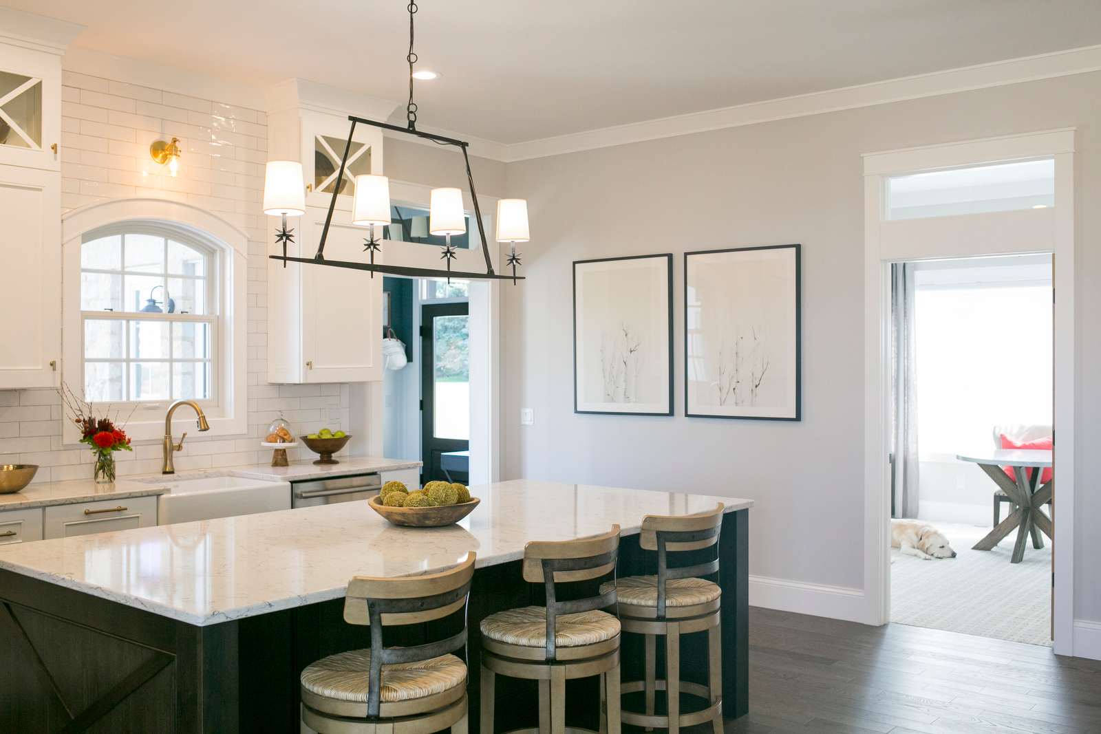
We really are enjoying the semi-openess to the dining area. It is nice not being able to see the mess involved in food prep while we’re sitting down to a meal.

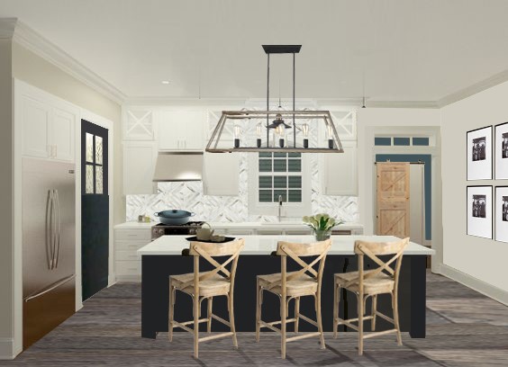
The arch top window is a nice balance to all of the straight lines. This area with the dishwasher on the right and the garbage on the left is highly used and we’re happy to report it is very efficient. The spacing between the perimeter and the island is perfect. We love the farmhouse style sink too! The maintenance is less than we expected based on reading reviews. Whew!

We really like having all of the appliances and the sink on the perimeter. It leaves a nice open countertop at the island for eating, working, and gathering. We really like having the microwave in the pantry too. Now if we could just install an automadically closing pantry door…that would be perfection!

The countertop was a difficult decision. One of the last, in fact. We both love it. We love the minimal pattern and the brightness of it. It doesn’t need constant wiping to look nice either. Crumbs don’t stick out like a sore thumb.
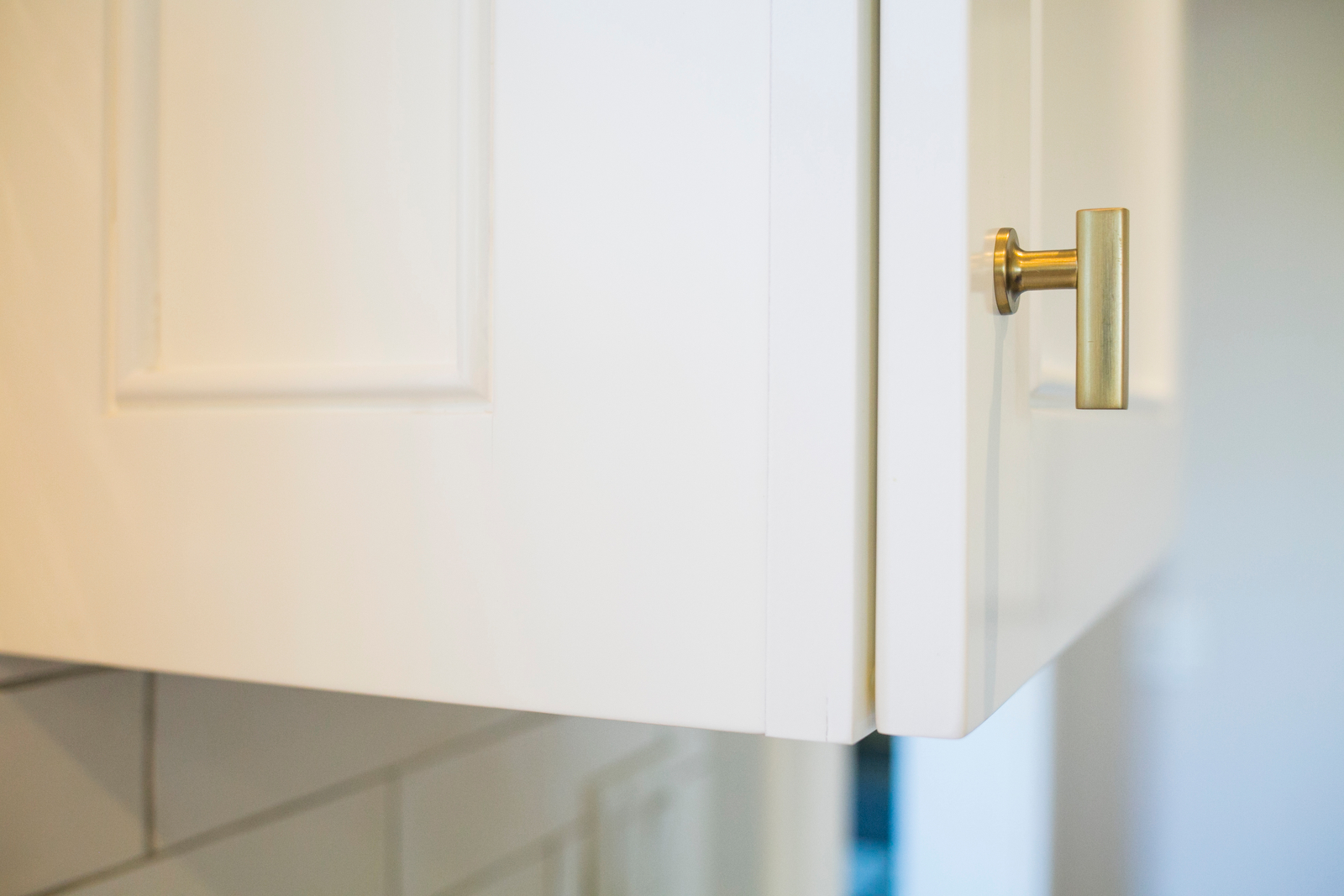
We went with brass finishes and we really like the warmth of it with all of the white. A mix of traditional and modern lines keeps things balanced.
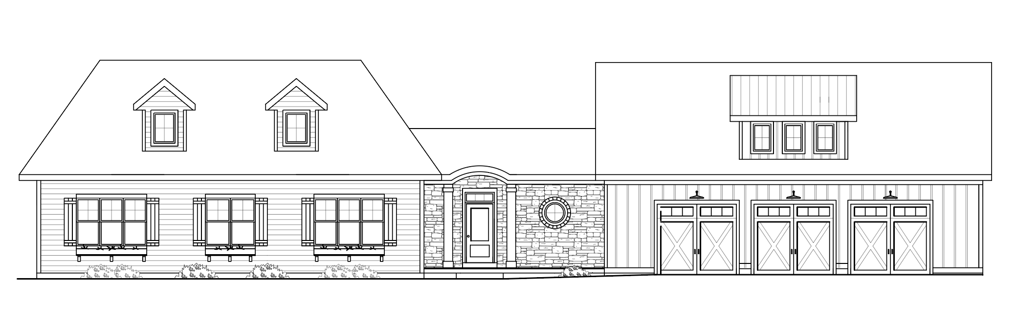
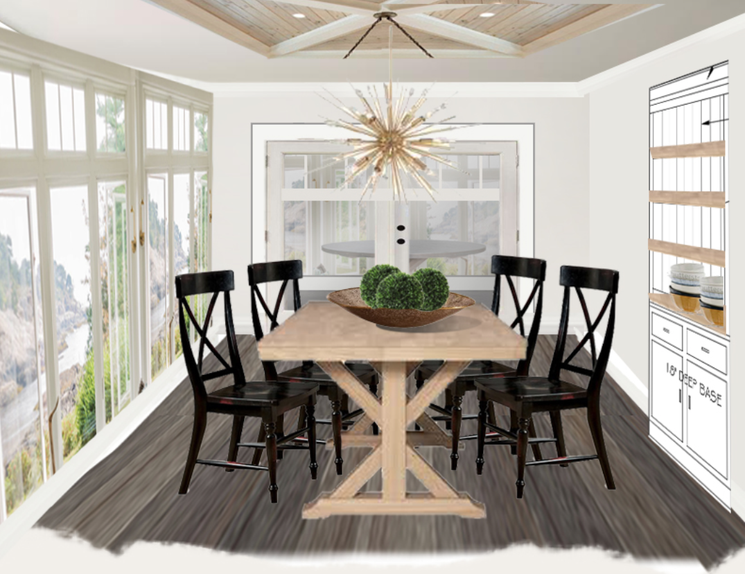
Below is a look back at the process and how it all started with some sketches, renderings, and product selection. Many choices changed through the process but take a look at the SHOP OUR HOUSE page to see the final selections.