Thank you SO much for your interest in our project. Whether you're interested in having a custom home built, considering a remodel, or have a decorating project, we REALLY hope you find the blog helpful. We've been asked some excellent questions over the past five months. We thought we'd share a few of those with everyone.
1. When are you moving in?
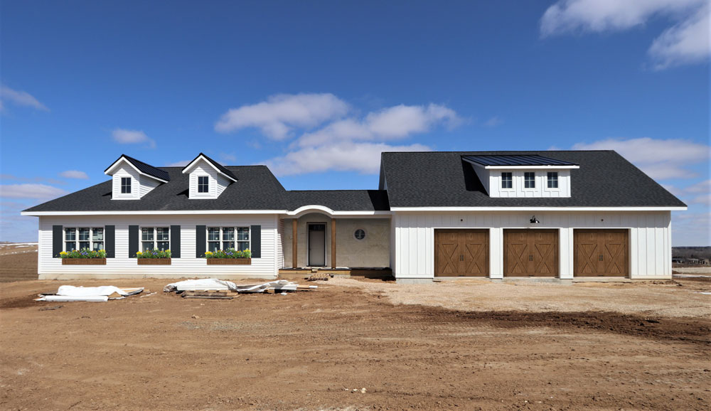
This is a question that makes us both laugh because you'd think we could answer at this point, but the truth is we're not sure yet. Our builder has given us a completion date for the house (early May) but that doesn’t necessarily mean that we’re moving in then. We need to coordinate the sale of our current home. We do know it's getting closer and we're getting excited! Construction began in October so the actual building of our home will take approximately 6 1/2 months.
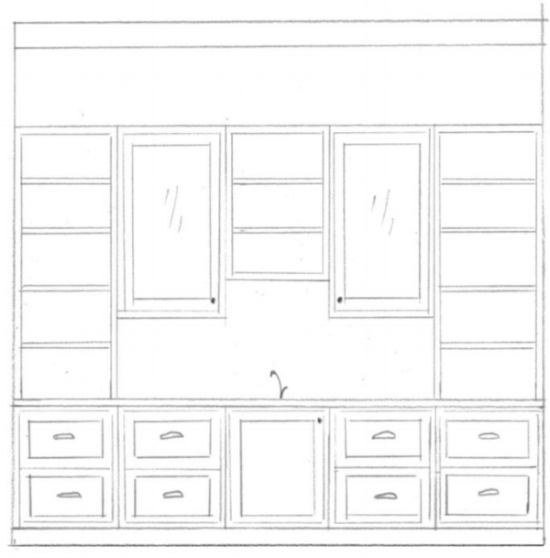
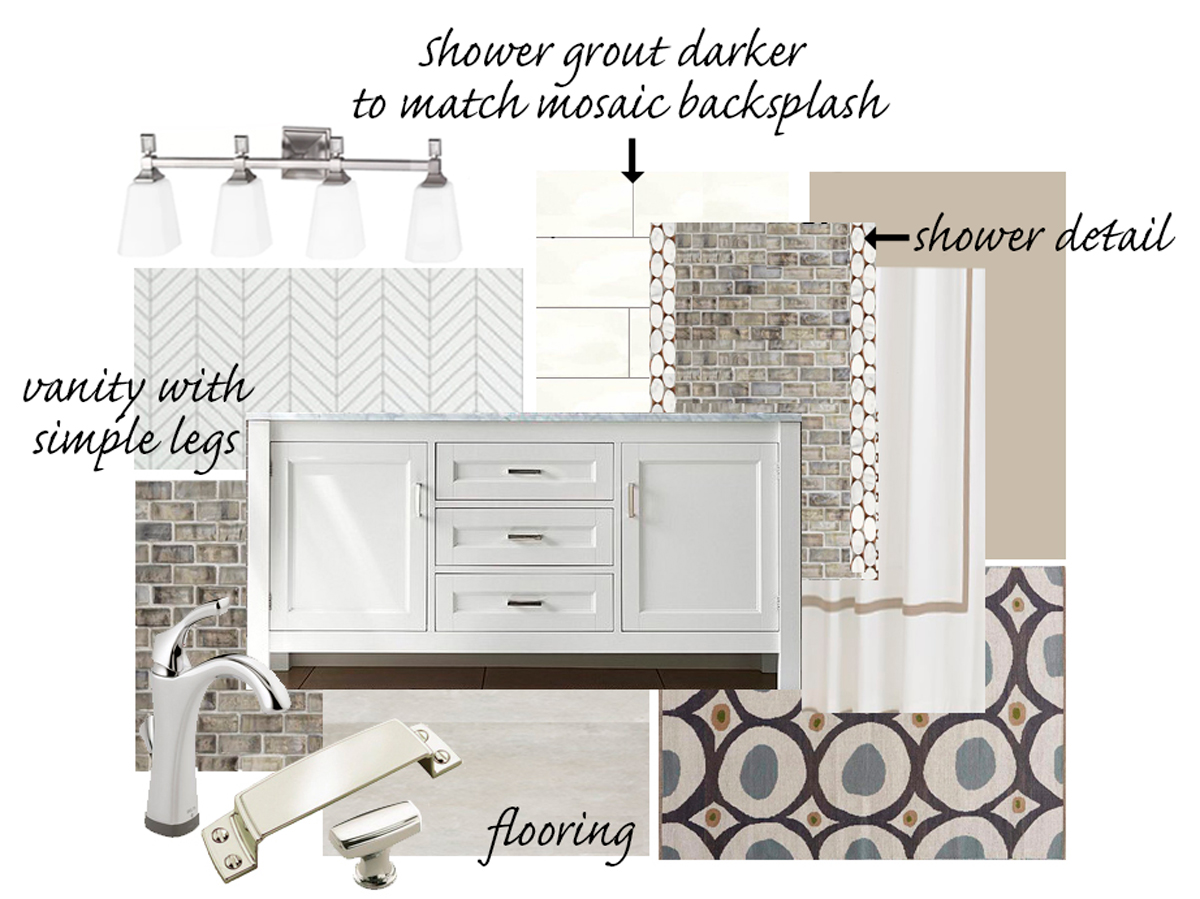
2. There are so many decisions to make, how did you decide to do what you did?
Our education and experience helps - no doubt! But, there's more to the building process than interior design and flooring. Over the past 15 years, we have been careful listeners and observers and we've used that to cultivate our own list of wants and needs. That includes listening to our clients as well as the professionals we work with. We also utilize resources online (houzz, Pinterest, blogs, etc) and use images to inspire our own ideas. We also love a good home and garden TV show. We've actually learned a lot from This Old House and it's good family entertainment. We love walking into the house during construction and saying, "Wow, that is so cool!" when we we get to see some of our ideas finally put in place.
3. With all of the work that you have done in preparation, has everything been seamless?
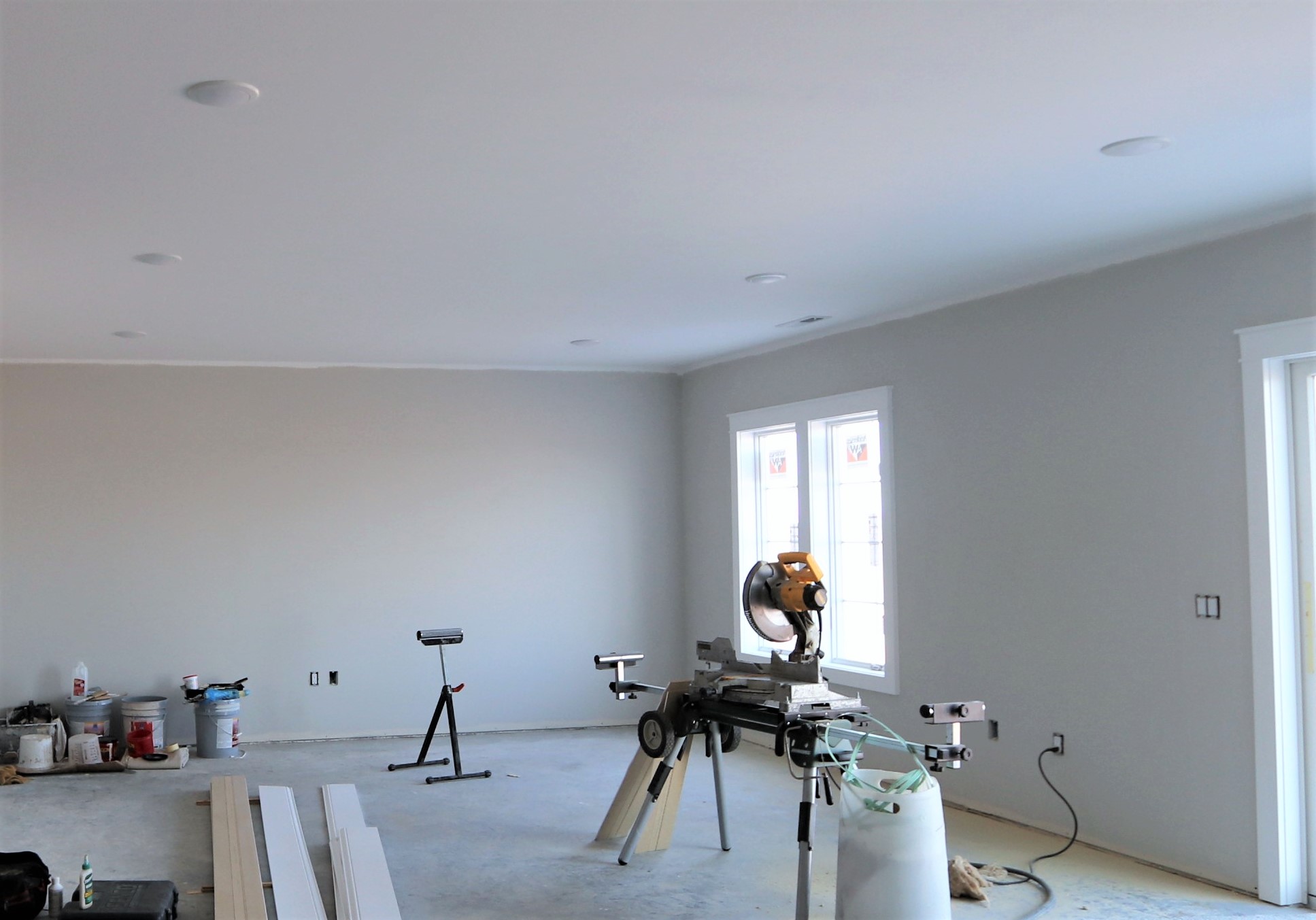
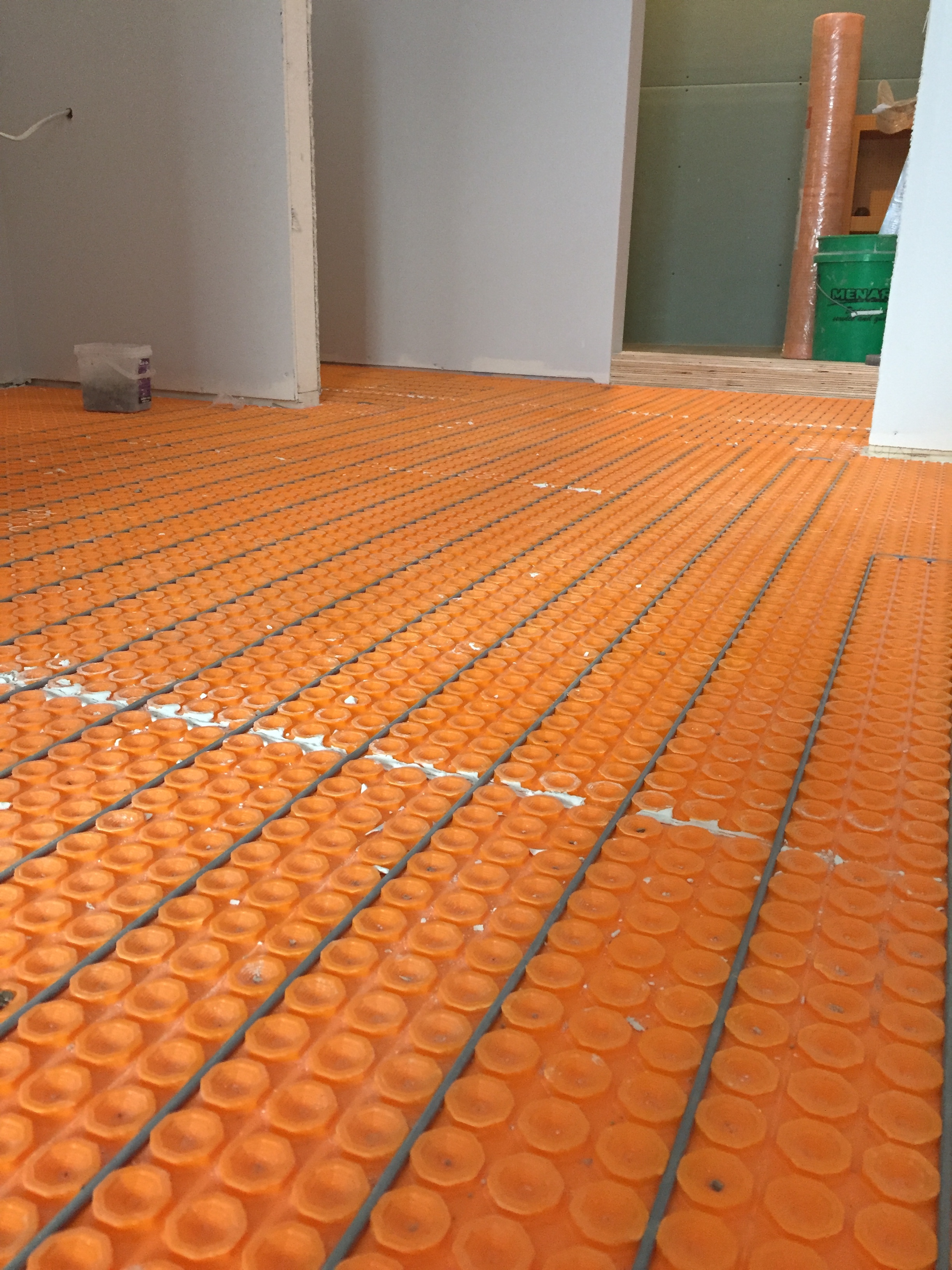
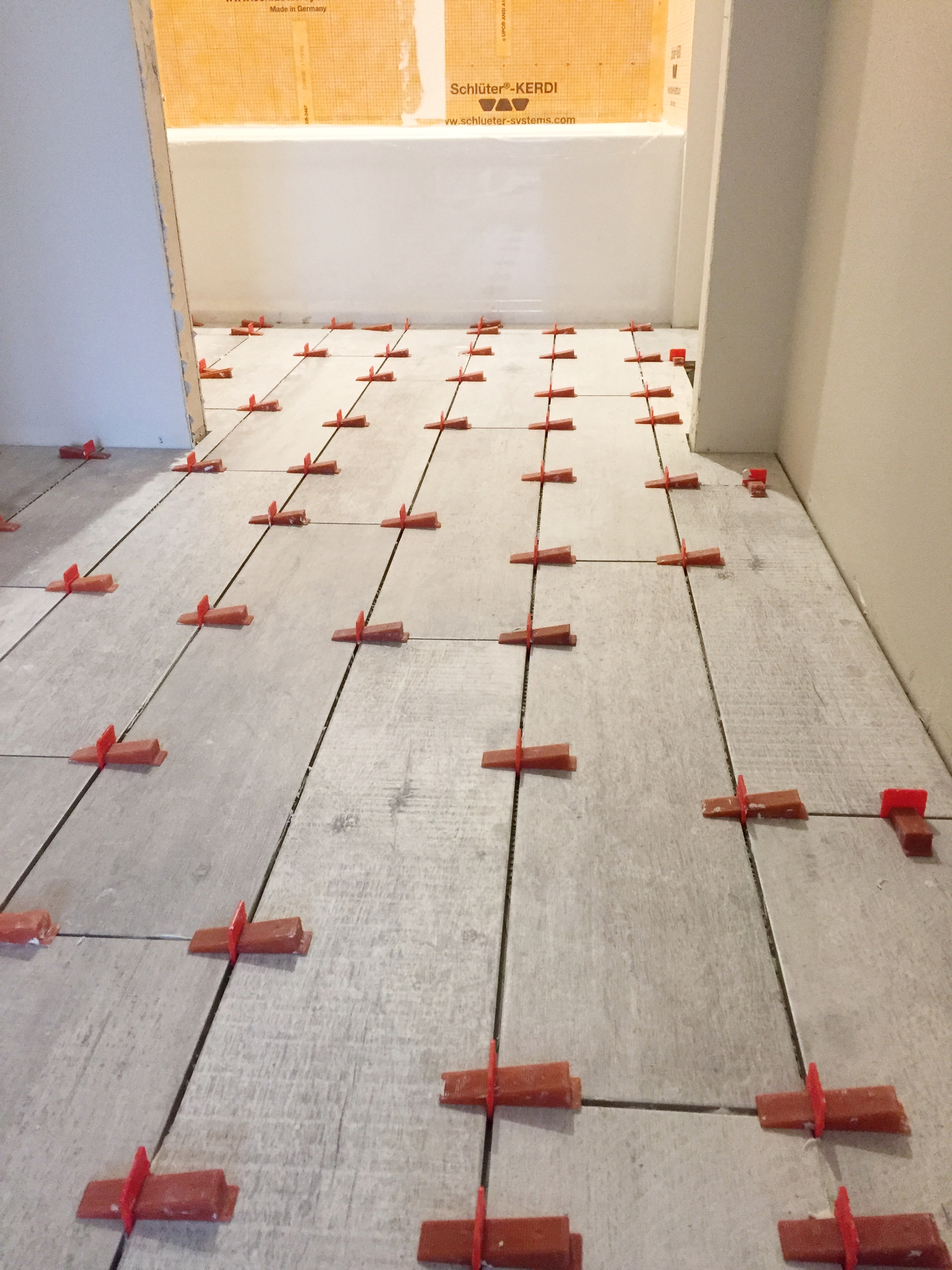
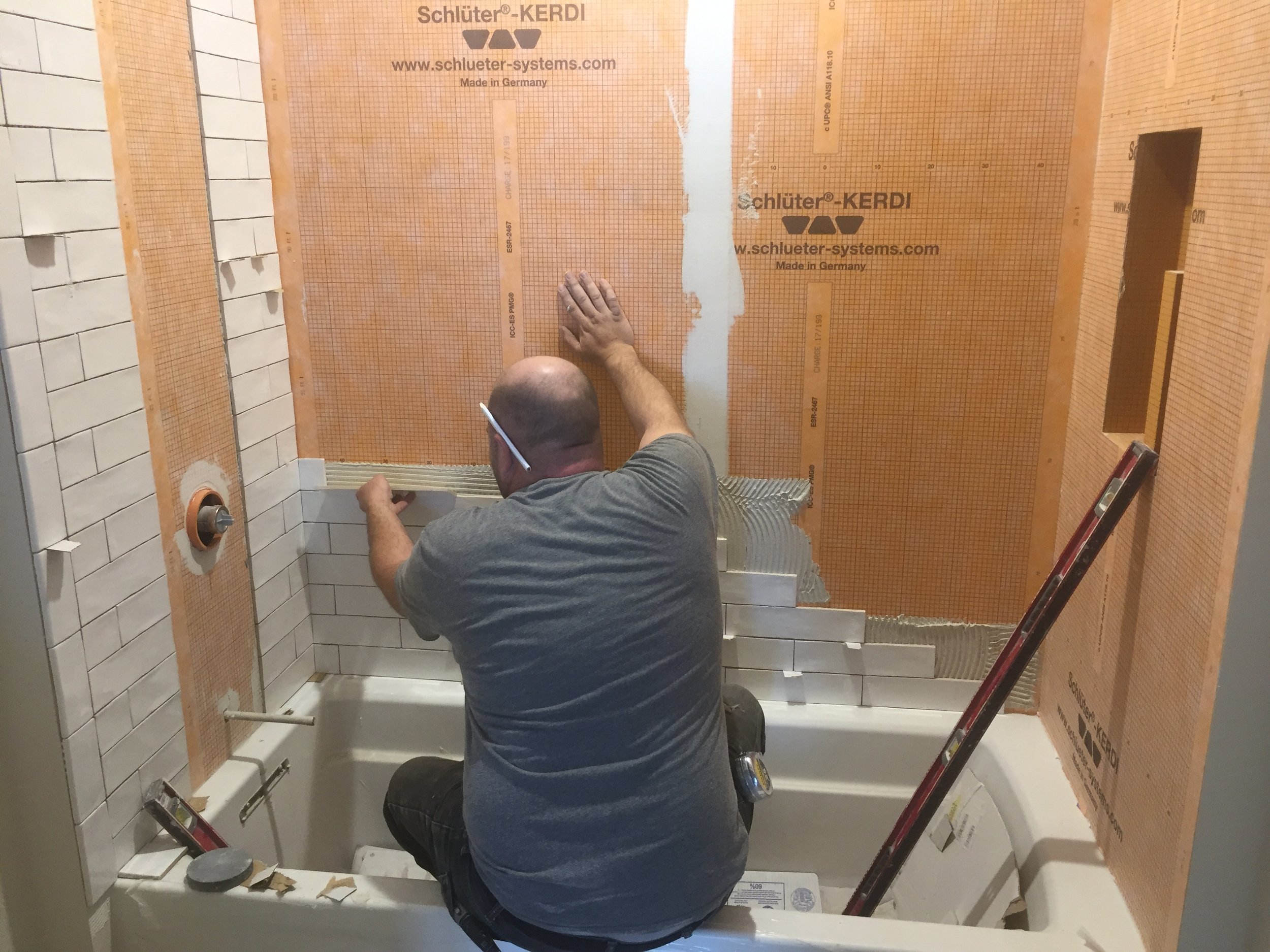
No. We make regular (daily) trips to the house to check on progress and make sure that all of the details are being done to our specifications. There have definitely been some “slap the forehead” moments and definitely some “tear up and re-do’s” but we are very happy with the outcome in those situations and the way that they have been handled by the people we are working with. If you want seamless, a custom house is not for you!
4. Do you enjoy going over to check on progress?
Yes!!! Most definitely. However, building a home is like having another job that you aren’t getting paid for. With all the planning, site visits, decisions, electrical walk through, HVAC walk through, cabinets, countertops, flooring (Ha Ha), lumber, doors, windows, on and on and on…….. You have to commit yourself to some late nights and full weekends. Even 2 professionals like us can suffer some burnout (not to mention the poor kiddo, thank goodness for some well-placed tech-time #Ithinkweregoingtobeoverondatathismonthagain).
5. How do you deal with ...(insert whatever you want)?
Knowing that not every decision you make in prep is going to work the way you want it to and being able to move past that is paramount to making the home building experience a good one.
Every contractor that works in our home has an opinion on how things should be done. We always listen because his/her experience can definitely lead us in the right direction; however, we also need to trust our instincts. We spent a lot of time thinking through the decisions we're making so we recognize the value in that too.
Thanks again for your interest. If you have any other questions you'd like answered, be sure to send them our way and we'll be sure to answer them in another post!